Amplifinity’s product, referred to as "Control Room," is a web application that includes a proprietary Content Management System for referral program-based websites. Control Room tracks the users of these sites, their referrals, builds a database of advocate profiles that analyzes advocacy trends, and allows for integration with the customer’s existing sales CRM and reward fulfillment providers.
For a long time, the Amplifinity product was viewed as a utilitarian sales tool to be marketed to sales personnel, with the preconceived notion that they would not care what it looked like as long as it delivered results. This was true for a period of time, but as the marketplace for similar referral-related software products continued to become more aggressive, Amplifinity found itself selling more to marketing personnel who cared a great deal about what the product looked like and were not impressed with its bland state.
Access to our product’s source was granted to me, allowing me to redesign many aspects of our product. My goals were to make Amplifinity look enterprise-level, classy, sophisticated, and cool, and I collaborated with the CMO to ensure that my vision for the improvements to the product aligned with our new idea of what prospective customers were expecting.
--
P R E – R E D E S I G N
The following three examples show the state of the Amplifinity Control Room before the redesign.
--
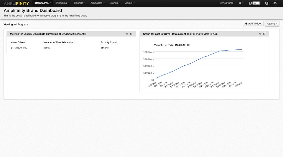
Dashboard – original state, pre-designer. Awkward use of space, poor selection of default data visualization options. Unexciting page.
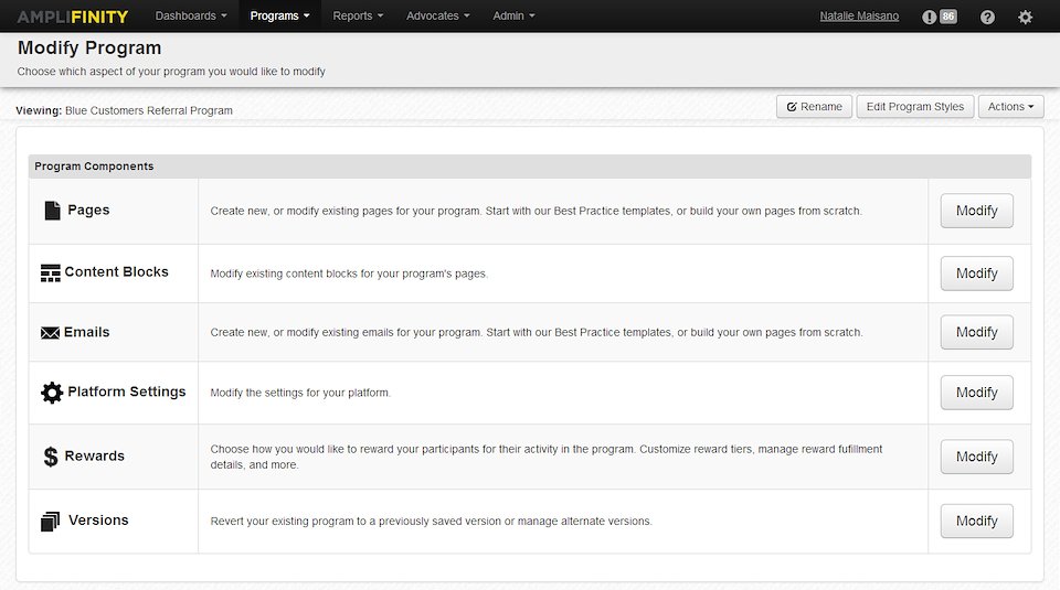
CMS Navigation – original state, pre-designer. Too monochrome, and tabular layout did not lend itself well to descriptions of sub-sections.
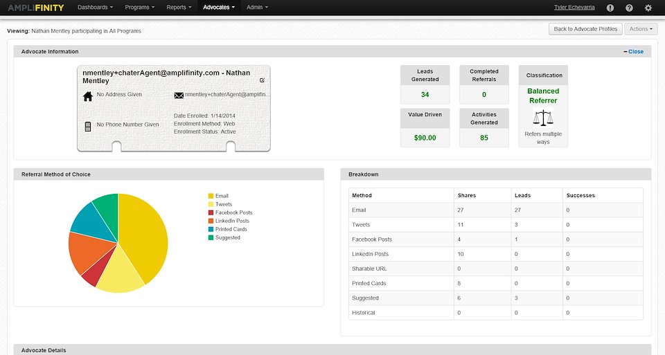
Advocate Profile – original state, pre-designer. Awkward use of space, ugly referral icons, inconsistent color palette.
--
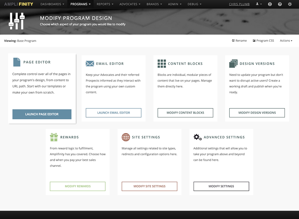
P O S T – R E D E S I G N
The following screenshots were taken from the Amplifinity Control Room production site after my redesign was completed.
--
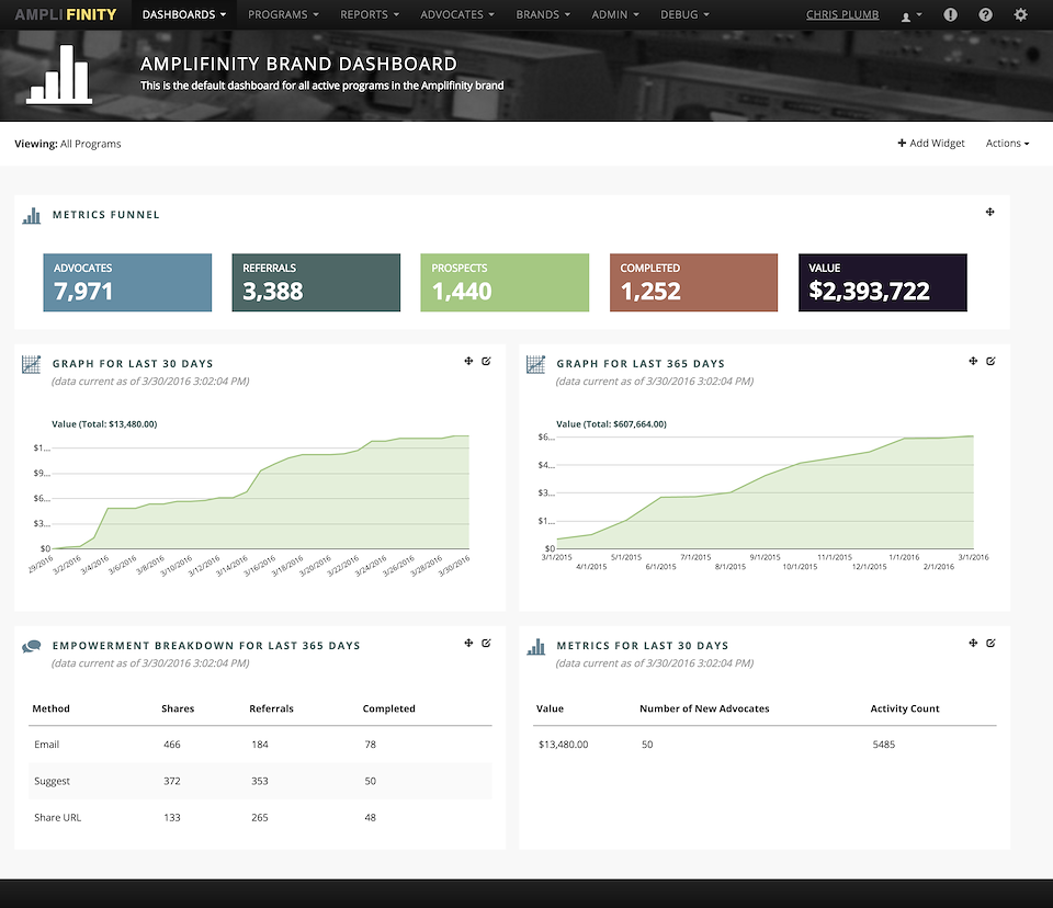
Dashboard, redesigned. New mega nav treatment. Photo-based masthead with icon. New color palette. Improved data visualization.
CMS Navigation, redesigned. Removed table in favor of descriptive containers that animate-in on pageload, and increase in size with subtle shadow on hover.
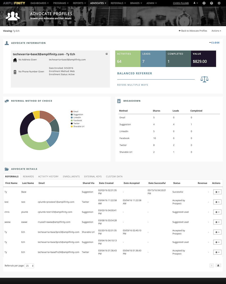
Advocate Profile, redesigned. Improved quality of referral icons, new color palette, improved data visualization.
Amplifinity Product Redesign
Redesign of the Amplifinity Product for a new audience and improve sales. Achieved via writing new LESS / CSS, rewriting and improving existing CSHTML, creating new raster and vector-based assets, designing and implementing a new color palette, and both sourcing and implementing stock photography to bring more personality to the product.
Role |
Front End Designer and Developer / Creative Director |
Type |
UI/UX Design |
URL |
www.amplifinity.net |